We studied paid ads from 11 top education companies, analyzed 15,000+ creatives, and broke down everything—
Ad formats
Emotional angles
How often they rotate creatives
What kind of hooks they use
What type of landing pages they drive to
Below is a breakdown of the top education brands, the patterns we noticed, and what you can steal for your ads.
Key takeaways at at the end.
Brand #1: MasterClass
MasterClass sells aspiration in the most polished way possible. Their creatives are sleek, cinematic, and feature the best of the best in the subjects.
They don’t sell education. They sell identity, skill mastery, and exclusivity.
Creatives: 4,778 (43% video, 57% image)
Style: Polished. No UGC. No AI.
Hooks: Expertise-first, celebrity-led insights, transformation through elite training
Emotions: Admiration, Inspiration, Curiosity
Strategy: Evergreen campaigns, tight brand control, consistent rotation
Pages: Annual access bundle LPs + core course pages
What They’re Doing Well:
Celebrity trust = built-in authority
Clean brand recall from polished visuals
Repetition of core messaging across many verticals
One ad that stood out:
Check my detailed analysis on MasterClass
Brand #2: Mindvalley
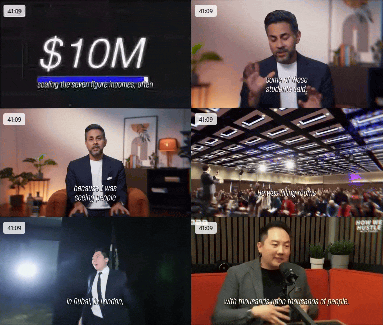
Some of the Mindvalley ads are like webinars. Some are 40+ minutes long. They're speaker-led, founder-led, and community-powered.
They sell transformation more than features: "Your best life starts here."
Creatives: 2,472 (63% video, 36% image)
Style: Long-form, influencer-led, polished production
Hooks: Life transformation, spiritual + productivity merge
Emotions: Hope, Determination, Confidence
Strategy: Heavy on webinar-style, long-form VSLs
Pages: Program-specific pages + summit event LPs
What They’re Doing Well:
Founder-led content builds trust
Community-focused storytelling
Expert credibility in every ad
One ad that stood out:
Brand #3: Outschool
Outschool speaks directly to parents.
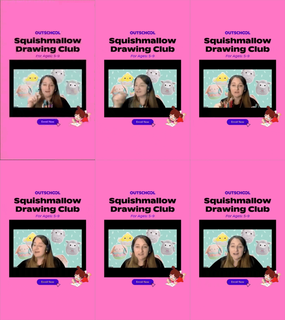
Their creatives feel real. Some are UGC, others feel like amateur product demos—and that’s why they work. They’re not polished. They’re believable.
Creatives: 1,366 (80% image, 20% video)
Style: Mixed. UGC + native-feel + some polished
Hooks: "Affordable online learning for kids", scroll-stopping visuals
Emotions: Joy, Relief, Curiosity
Strategy: Persona-led messaging with fun/quirky visuals
Pages: Subject/category pages
What They’re Doing Well:
UGC-style builds trust fast
Leans into real parent/student use cases
One ad that stood out:
Brand #4: Synthesis
Synthesis shows outcomes. Their ads show how the product changes a student.
Most of their ads are native, lo-fi, or testimonial-style. Some of them feel unpolished (but in a good way).
Creatives: 1,051 (65% video, 32% image)
Style: UGC + testimonial + raw demos
Hooks: Problem-first: outdated schooling vs new models
Emotions: Curiosity, Confidence, Relief
Strategy: Show, don’t tell. Outcome-driven messaging
Pages: Program LPs
What They’re Doing Well:
Scroll-stopping, lo-fi creatives
Highlights the contrast between old/new systems
One ad that stood out:
Brand #5: Duolingo
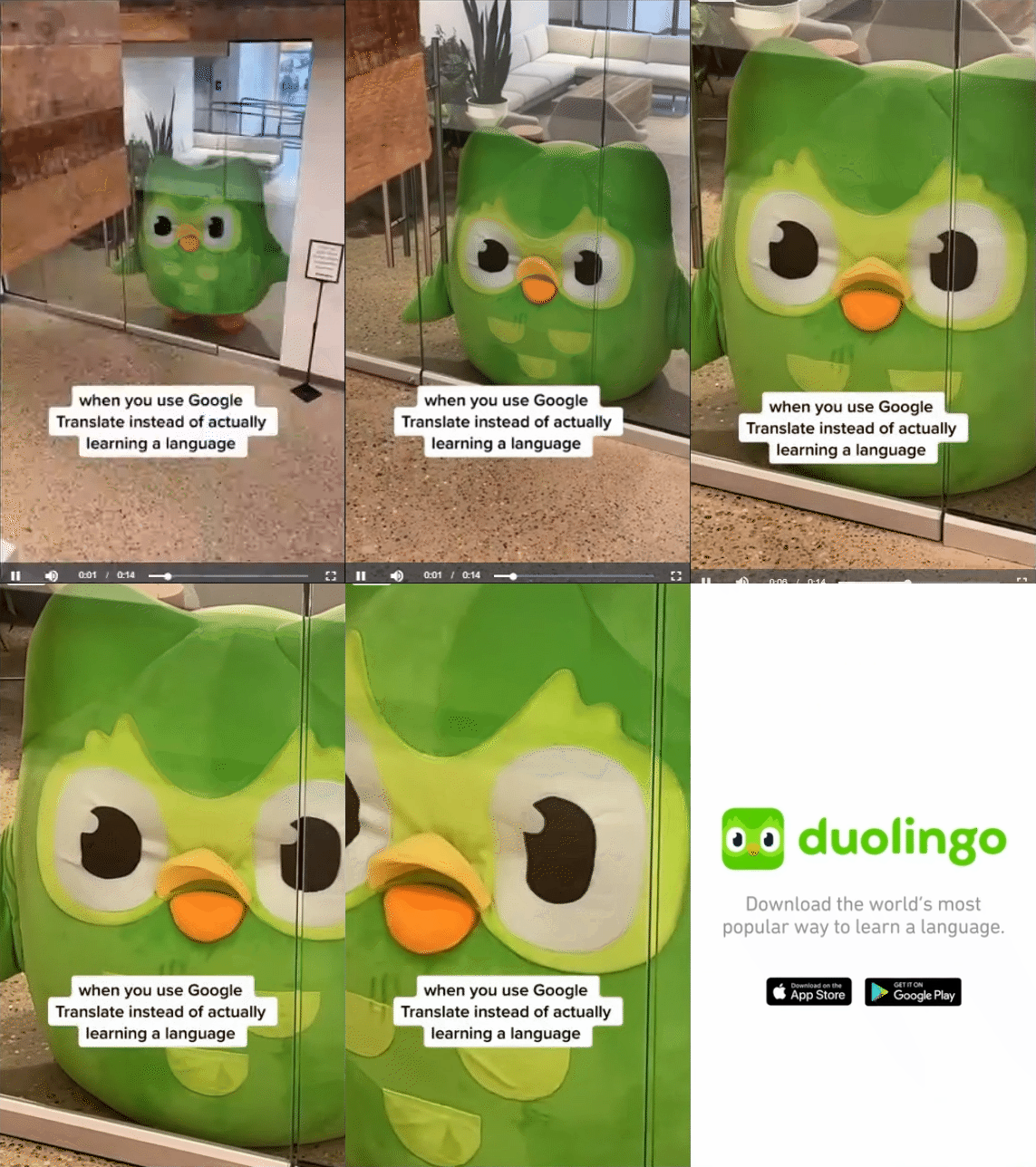
Duolingo's ads feel like their app: fun, animated, and exciting.
The brand uses it in-app experience to lead the visuals.
Creatives: 680 (78% video, 22% image)
Style: Animation-heavy. App screenshots. App walkthroughs. Few UGC.
Hooks: "See how Duolingo works"; strong demo-led story
Emotions: Playfulness, Joy, Satisfaction
Strategy: Product-led. Demo-focused.
Pages: App store links
What They’re Doing Well:
Strong brand identity (the owl and the other characters)
Great product demonstration in ads
Where They Can Improve:
Community stories are missing. They’ve a huge community they can use.
One ad that stood out:
Brand #6: Coursera
Coursera’s ads are clean, simple, and academic.
They rely on graphic design and headlines, not deep emotions. Few UGCs. Minimal characters.
Creatives: 1,043 (25% video, 75% image)
Style: Branded graphic ads, no b-roll, no characters
Hooks: Credentialing, cost-saving, career advancement
Emotions: Trust, Security, Efficiency
Strategy: Program-driven, little scroll disruption
Pages: Course-specific and topic cluster LPs
What They’re Doing Well:
Professional tone that aligns with brand
Clear CTA around certification and ROI
Where They Can Improve:
They can add deep emotions
No personality or storytelling
Not enough scroll-stopping ads
Brand #7: Masterschool
MasterSchool feels like a smart mix of credibility and scroll-stopper.
They show instructors, founders, and career outcomes—but some ads are lo-fi enough to blend into native feeds.
Creatives: 416 (59% image, 39% video)
Style: Credibility-forward, some UGC, some ugly
Hooks: Instructor-led, “get hired”, remote career angles
Emotions: Confidence, Security, Inspiration
Strategy: Tests formats often, some UGC/podcast formats
Pages: Data and dev career LPs
What They’re Doing Well:
Good experimentation mix
Real teachers = real trust
One ad that stood out:
Brand #8: Babbel
Babbel goes wide. They target all awareness levels. And they do it with meme trends, humor, and solid before/after and comparison structures.
Creatives: 1,283 (56% image, 43% video)
Style: Trend-based, comparison-heavy, meme-forward
Hooks: “Before Babbel vs after”, “Most downloaded app”
Emotions: Humor, Joy, Confidence
Strategy: Awareness stage targeting + trend hijacking
Pages: Trial offers, subscription promos
What They’re Doing Well:
Covers all buyer stages
Trend adaptation + visual humor
One ad that stood out:
Brand #9: BoldVoice
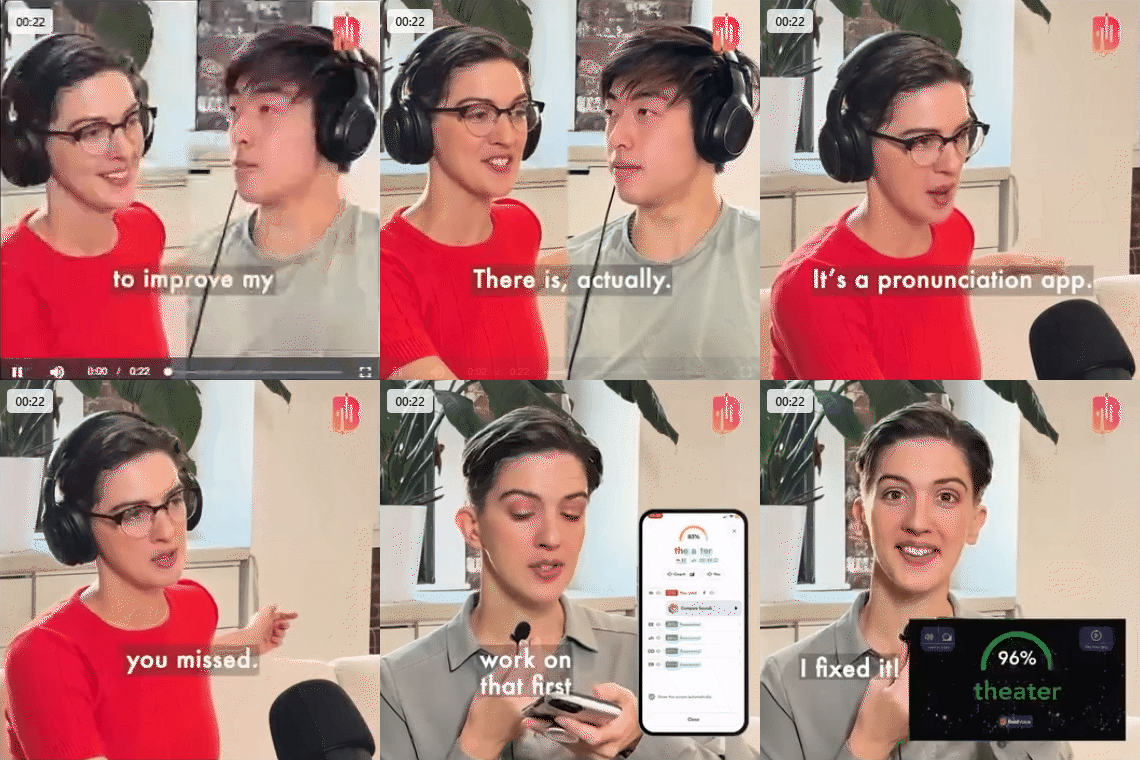
BoldVoice shows how their product works, with interactive videos that also show demos.
Some ads feel like podcast clips, and they have good ad scripts. But they’re not testing hard enough.
Creatives: 507 (79% video, 21% image)
Style: Scripted product explanation, podcast-like VO
Hooks: Accent clarity, professional growth
Emotions: Confidence, Aspiration
Strategy: Calm, explanation-based storytelling
Pages: App store LPs
What They’re Doing Well:
Clear product use case
Demonstrates results directly
One ad that stood out:
Brand #10: Skillsta App
Skillsta ads are bold, authentic, and creative.
They lean into ugly ads, b-roll, and real-looking scroll-stoppers that feel genuine.
Creatives: 767 (50% image, 50% video)
Style: B-roll, UGC, raw demos
Hooks: Career growth, celebrity drops, transformation
Emotions: Excitement, Curiosity, Confidence
Strategy: Scroll-stopper heavy, low-fi edits
Pages: Bundle LPs + course pages
What They’re Doing Well:
Ugly ads that stop the scroll
Clear pain points in visual form
One ad that stood out:
Brand #11: Augment.org
Augment takes a serious tone. Their ads feature experts, often in explainer style.
They’re clean and polished, but they may be too clean for scroll feeds.
Creatives: 55 (76% video, 24% image)
Style: Polished, direct-to-camera expert VO
Hooks: “Here’s why you need an MBA alternative”
Emotions: Authority, Clarity, Confidence
Strategy: Podcast-style cuts, clear messaging
Pages: MBA landing pages, seasonal promos
What They’re Doing Well:
Strong expert-led positioning
Very clear offer structure
One ad that stood out:
Key Takeaways From Studying 11 Education Brands (and 15,000+ Ads)
Showing how the product works. People like seeing how the app or course actually works.
Ads and landing pages must match. A clear connection between the two improves conversions. Most importantly, matching the emotions.
Emotion beats logic. Confidence, curiosity, and joy made ads more clickable. Education is all about achieving an outcome. Make sure those outcomes are connected to those emotions.
Clear promises get more clicks. Say exactly what the user will get.
Low-fi ads still win. Ads that don’t look like ads grab attention.
Testing more creatives = faster learning. More variation helps brands find winners quicker. This means adding diverse range of creatives, not just one.
Testimonials are underused. Real student stories build real trust. THIS was surprising. You can clearly stand out if you use students stories.
Brand personality matters. Humor, memes, and playfulness make people remember you.
UGC isn’t for everyone, but native-feel helps. Even polished brands can blend in with behind-the-scenes content.
Most brands ignore the top-of-funnel. They focus too much on selling and not enough on awareness of the problem or outcome.
New ad formats these brands are rarely using:
Podcast-style clips
Skits and storytelling
One-shot raw videos
Street-style interviews


