Static image ads are your simplest tool to enhance creative volume, diversity, velocity, and ROAS.
They load fast, work across multiple placements, and often have higher click-through rates (CTR) than video ads at the bottom of the funnel (BOFU).
But many advertisers are doing static ads wrong.
They overcomplicate the design, stuff too much text, or forget that simplicity wins.
Today, I’ll break down everything I’ve learned about making static ads work—from key principles to ad formats that actually convert.
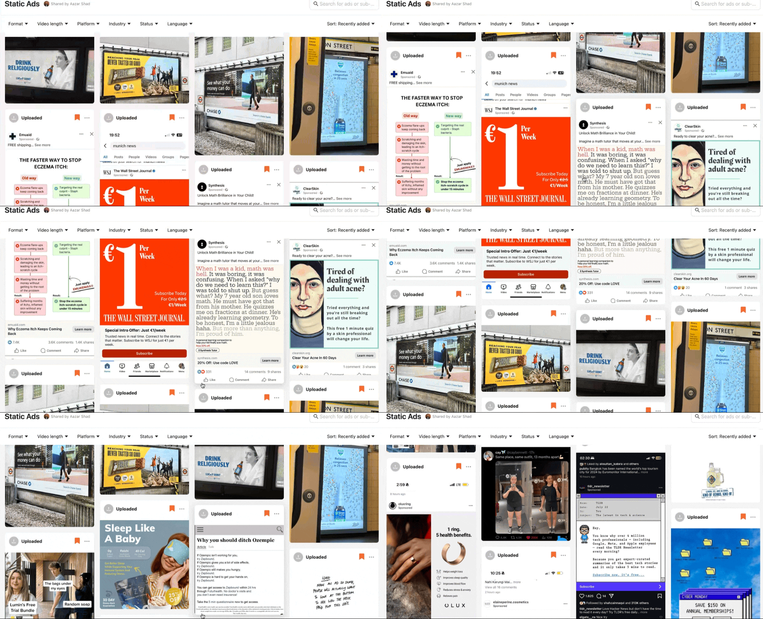
Here are all the examples if you need to save in Atria:
Let’s start…
1. The Key Mindset Shift for Static Ads
Most people think their ad needs to "stand out" in the feed. Instead of fighting for attention with bright colors and excessive branding, lean into native, organic-looking designs that blend in.
The best static ads don’t scream “look at me.”
They blend in, making the ad feel like native content
They are effortless to process and don’t overwhelm the user
A great static ad should feel like it belongs on the platform, not like an interruption.
What This Means for Your Ads
Less is more. Avoid clutter and excessive design elements
Unbranded ads often work better than branded ones. Overbranding makes an ad feel more like an ad
Shorter copy is often better because it is immediately scannable.
Native visuals work better. Avoid anything that looks overly polished
I’ve tested branded vs. unbranded static ads, and branded versions consistently underperformed. The more organic an ad looks, the higher the engagement.
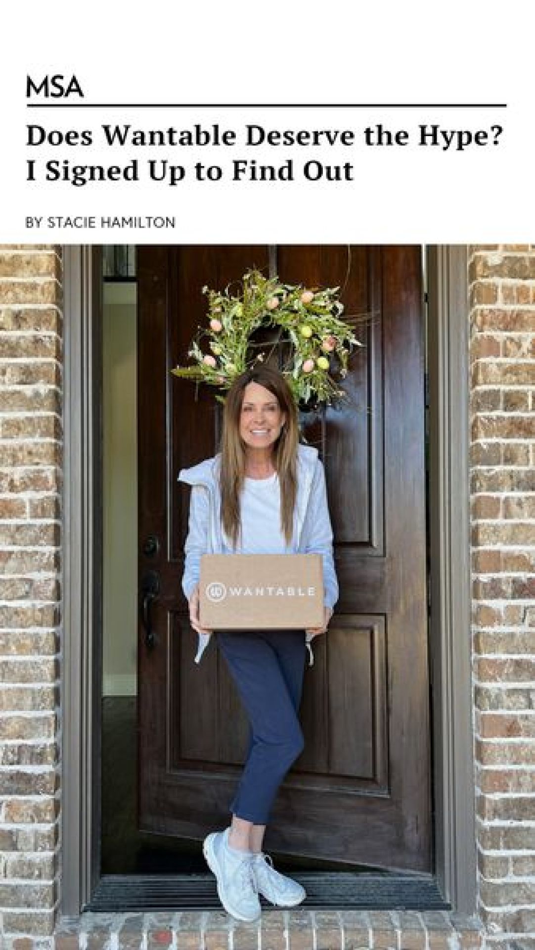
Here’s an example ad that does it simply well:

2. The Two Biggest Levers: Image + Copy
Static ads only have two key elements:
The image (First thing people see)
The copy (If they decide to read)
If your image isn’t stopping people, the copy doesn’t even matter.
How to Optimize the Image
Use real-life images → Feels authentic, doesn’t scream “ad”
Minimalism is key → Fewer elements = less friction
Product shots work well → Show it in real use, not a polished render
Before & After visuals → Clear transformation
UX Familiarity → Mimic familiar UI elements (e.g., checklist, price charts)
Relevant to Audience → Show something relatable (and going on in your audience’s head)
What doesn’t work?
Stock photos → Feels fake, lowers trust
Overly polished designs → Users recognize it as an ad and scroll past
3. Headline & Subtext (Both Matter)
Most advertisers obsess over headlines, but subtext is just as important—sometimes even more.
A strong headline grabs attention.
A great subtext convinces them to take action.
What works best?
Short, scannable phrases (under 7 words) → Best for product-aware audiences
Medium-length sentences → Best for problem-aware audiences
Long-form text → Works for highly engaged audiences (but hurts CTR in fast-scrolling environments)
Aron (one of the great follows on X) put this well in an X post:
Check the X post.
For example, for a menopause supplement ad, a simple "Relief in 30 days" works better than "Our revolutionary menopause support formula" because the audience is already problem-aware.
Here’s an example of an ad that’d do well even without a strong headline:
4. The Psychology of Static Ads
Ads that trigger emotions perform better—not speculation, but science.
Users process visuals 60,000x faster than text, which means your image needs to communicate the message instantly (within 0.3 seconds).
Here’s an example of a visual that hits deep for people with snoring problems
People don’t read ads. They feel them first.
Before worrying about the design, colors, or copy, ask yourself:
What emotion do I want to trigger?
Every high-performing static ad is built around a specific emotional response. The image, copy, and design should work together to spark that feeling instantly.
That’s the start… now, get deeper.
How to Use Psychology in Static Ads
Match the image to the audience’s problem → If they see their struggle in the image, they’ll stop
Use colors strategically → Blue = Trust, Red = Urgency, Green = Health/Natural
Use "anti-customer keywords" → Repel the wrong audience to qualify the right one
Leverage technical terms (for MOFU audiences) → Industry-specific words filter out unqualified users
Using "Anti-Customer keywords" to Qualify the Right Audience
We’re used to ads that call out the customers, but if you want to qualify the right audience, call out who it’s NOT for. This helps filter out bad leads and makes the right people feel like the product was made specifically for them.
5. The Best Static Ad Formats
I’ve tested hundreds of static ad variations. These six formats consistently outperform others:
Us vs. Them → Direct comparison ads
Before & After → Shows transformation clearly
Advertorial Style → Mimics a news article layout

Venn Diagram → Overlapping benefits (e.g., price vs. quality)
Meme Ads → Casual humor that promotes the offer
Minimalist, CTA-Only → Just a simple offer with no distractions
Banger Headline → A good headline and compelling offer
Billboard Ad → Bold visual, minimal text, instant clarity.
Calling Out Audience Ad → Directly speaks to a specific group.
Addressing a Pain/Problem Ad → Highlights frustration, offers a solution.
Direct Compelling Offer → Clear, no-fluff deal that’s hard to ignore
I’ve shared just a few here… you can scroll more in this Atria Board.
Thanks to our partners who support this newsletter.
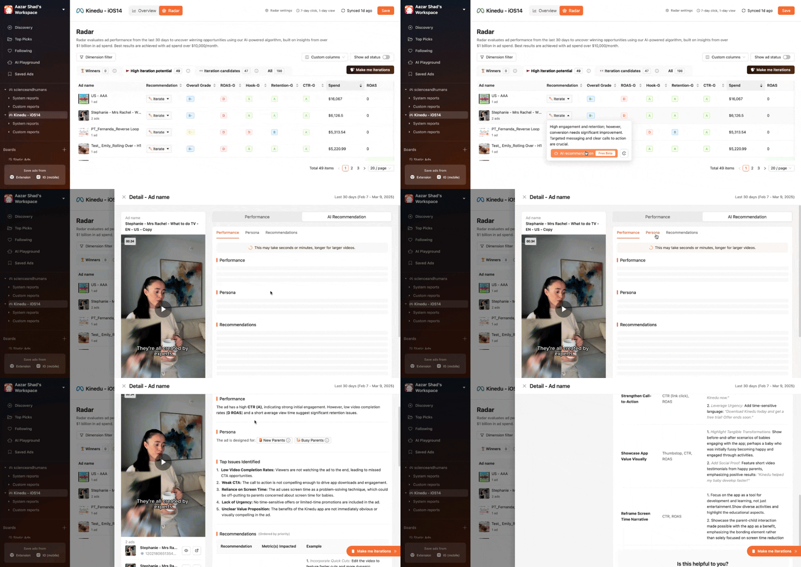
Atria: You're only as good an advertiser as your swipe file. Atria helps save good ads and analyze them in-depth. But the best part? Their AI helps me create concepts and scripts within seconds. Check it out for free. Most importantly, they now have built-in ad analytics to make more winning ads.
Atria also now has an AI Creative Strategist called Radar that gave me some really good iteration ideas, check this out:
Creative OS: Don’t waste your designer’s time in copying swipe files. Get all static ad templates to increase your experiments and ad creatives’ velocity. Check it out here.
If you’re into AI, Cody Plofker (CEO of Jones Road Beauty) is using AI with Creative OS to make landing pages in a day. Check this.
My Other Static Ads Tips That Helped Me
Audience aged 40+ works even with no headline copy. Just use an image + ad copy in the caption.
Unbranded ads often outperform branded ones. People scroll past obvious ads.
Minimalist images work best. The simpler the design, the higher the CTR.
Use anti-customer language. Call out who the product is NOT for to filter bad leads.
Technical terms boost performance at MOFU/BOFU. They signal credibility and attract serious buyers.
Dark backgrounds often outperform bright ones. They stand out better in busy feeds.
Including a CTA in the image isn’t always necessary. Let the ad copy do the work.
Product in real-life settings > Polished product shots. Feels more native and authentic.
Testimonials with highlighted text convert well. People trust other users more than brand claims.
Curiosity-based headlines pull higher CTR. Example: “This changed how I sleep forever…”
Before & After images still work. The transformation tells the story instantly.
Comparison works in static ads. They simplify decision-making for the user.
Native ad-style posts win. Ads that look like regular content perform better.
Short, punchy copy works best for product-aware audiences. Keep it under 7 words.
Testing different emotions in visuals matters. First, decide what you want users to feel.
0.3 seconds is all you get. If the image doesn’t hook instantly, it’s a bad image.
Avoid using too many elements. Clutter kills performance.
Ads with subtle movement (GIFs) can outperform still images. Test animated statics.
Don’t put your brand name in the headline. Solve the problem first, and introduce the brand later.
Users skim, they don’t read. The message should be clear at a glance.
That’s all from this week!
Happy Growing with Paid Social,
Aazar Shad
Since this newsletter is free, I do it to follow my curiosity. But I’d love it if you could leave some feedback so I know if I am helping you or not.
Two ways I can help you, whenever you are ready:
And if this was forwarded to you, subscribe below with 1-click:


