What's up, Marketers! This is Aazar.
This newsletter is about leveling up your paid growth marketing skills by analyzing the best brands' paid strategy, tactics, positioning, and value props.
This newsletter is divided into:
Sharing what I've learned
Sometimes sharing some other performance marketers’ lessons with you
And I analyze & compare the best ads on the internet (this issue)
I analyzed over 1,000 winning video ads that stayed live for more than 30 days across 7-, 8-, and even 9-figure Meta ad accounts.
But here's what shocked me: one brand took a $20 product, launched into the most saturated market, and built a $126.5M empire using a strategy most brands completely miss.
The 4-quadrant targeting system that lets you scale to $1.5M+ monthly ad spend
How they test creatives AND landing pages simultaneously for maximum ROI
Why they run thousands of ads instead of hoping one winner carries everything
The psychology behind targeting narrow audiences without detailed targeting
BEST LINKS OF THE WEEK (on popular demand)
My favorite finds
If you've scrolled Instagram in the last year, you've seen an AG1 ad.
They're everywhere. They've spent millions. They basically own the greens category.
So how do you compete with that?
IM8 figured it out. IM8 is a supplement brand backed by David Beckham but I don’t see him in the ads at all.
And instead of running away from the comparison, they're turning AG1's dominance into their own advantage.
They're not trying to teach people about greens supplements (AG1 already did that work).
They're just showing up and saying, "Yeah, but have you tried the better version?"
And their ads are actually good.
You'll see how they turn comparison into credibility, how they make switching feel easy, and how they use visuals that most brands overthink.
If you're going up against a bigger competitor, this breakdown has the exact frameworks you need.
Ad #1 – The “Logical Switch” Story
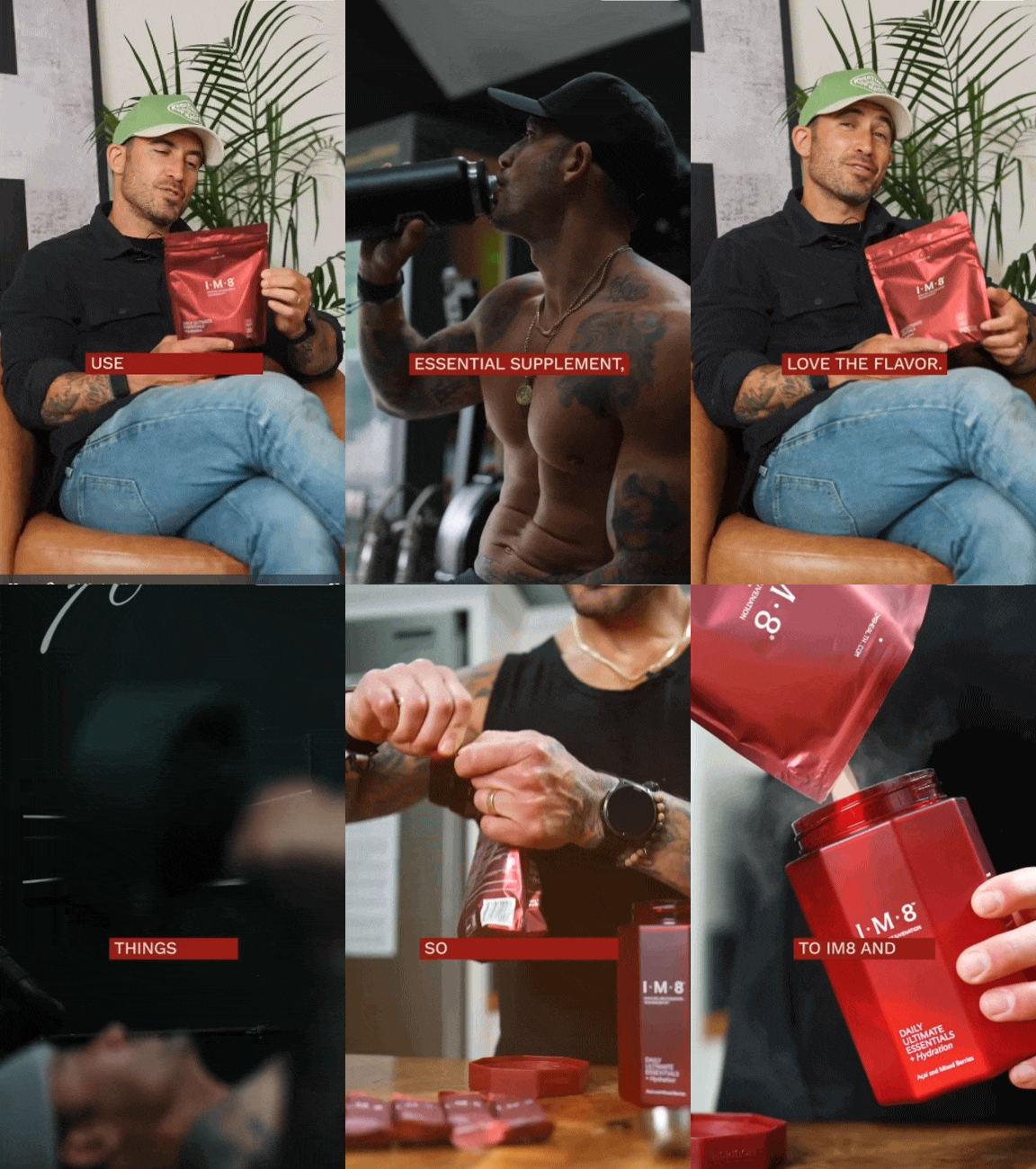
This ad shows why someone switched from AG1 to IM8.
It starts with honesty:
“I used another daily essential supplement, but I just didn’t love the flavor.”
That one line makes the switch logical, not emotional. It mirrors what thousands of AG1 users feel but rarely say.
If we break down the pieces of the script, create a rational arc that builds credibility:
I tried other supplement aka AG1 (category validation)
Didn’t like the taste (pain)
Found IM8 (solution)
Sleep improved and other benefits (proof)
David Beckham uses it (authority)
Why It Works
Logical Switching → It mirrors what many real customers feel but haven’t said out loud.
Taste as the Trojan Horse → A simple, relatable reason to switch — not technical, just human.
Authority Stack → Ending with “David Beckham uses it” anchors the brand’s legitimacy.
Low-Friction Framing → Feels like a testimonial, not an ad.
What You Can Learn
Don’t oversell — let logic and relatability do the heavy lifting.
Position smartly — if your competitor dominates awareness, position yourself as the better alternative through a “same but better” story.
Use pain-driven logic like “I wanted the benefits, but didn’t enjoy it” instead of generic praise.
Ad #2 – The “Turn Off / Turn On” Visual
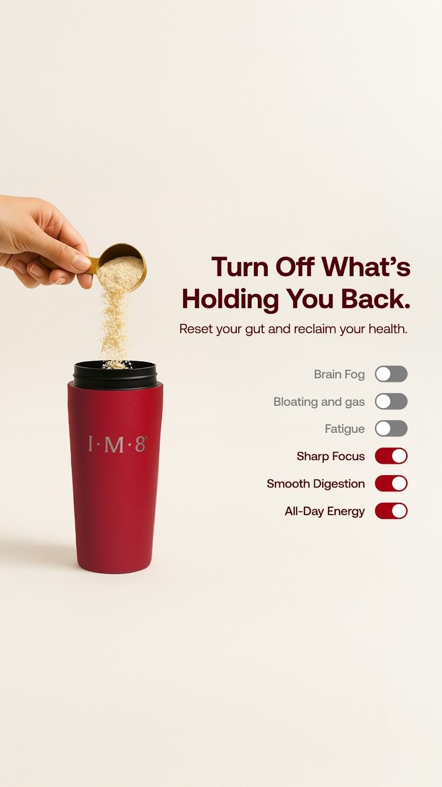
“Turn Off What’s Holding You Back.”
No dense copy. No long claims. Just toggles, the same ones you see on your phone.
Each switch tells the full story:
Off: Brain Fog, Bloating, Fatigue
On: Sharp Focus, Smooth Digestion, All-Day Energy
It’s instantly clear and visually satisfying. The design turns a complex idea (body optimization) into a simple, familiar action like flipping a switch.
Why It Works
Pattern Familiarity. Phone-style toggles make the message intuitive.
Micro-Dopamine Effect. Switching from “off” to “on” feels rewarding.
Contrast Psychology. Red ON toggles stand out against muted OFF ones.
Effortless Framing. No claims or ingredients, just instant understanding.
What You Can Learn
Let visuals do the work — a great design can explain your value at a glance.
Borrow from UI cues — familiar interactions grab attention faster.
Show the transformation — make people feel the before and after visually.
Ad #3 – The “Aquaman Energy” Ad (I wish it would be this easy to steal)
This ad wins on instant attention.
The first frame shows a muscular guy doing barbell curls underwater — and for a second, and he actually looks like Aquaman 😂.
That’s enough to make anyone stop scrolling.
And his physique literally makes you think, “Whatever this guy does, I want to do.”
Then he opens with a line that flips the supplement narrative:
“You can have a perfect diet and still be malnourished.”
That’s a powerful curiosity hook with authority.
It challenges what people think they know about nutrition and earns attention for what follows.
Why It Works
Visual Power. Underwater workout + Aquaman-like presence = instant scroll-stopper.
Curiosity Hook. “Perfect diet but still malnourished” flips expectations.
Aspirational Credibility. You trust him because he embodies the result, not because he’s selling it.
Authenticity Over Hype. Feels more like sharing than selling.
What You Can Learn
Lead with aspiration — visuals that inspire are stronger than claims.
Challenge assumptions — statements that disrupt “common sense” grab attention.
Show, don’t tell — let the messenger look like the outcome.
This ad is based on instant credibility.
It opens with:
“Hi, Dr. Shah here, I want to take a minute to talk to you about cellular health.”
And just like that, the viewer stops scrolling — because it feels like advice, not advertising.
The key line is this:
“I’ve seen 30-year-olds with cells that look like they’re pushing retirement,
and 60-year-olds with cells that look like they’re 40.”
That line alone reframes aging.
Then the analogy lands perfectly:
“Your cells are like phones with limited battery.”
It's simple and memorable.
The ad closes by literally stacking credibility like partnerships with Oxford University, the International Space Station, and an NSF certification, turning it into a scientific validation story.
Why It Works
Instant Trust. Doctor-led framing gives credibility from the first second.
Strong Visual Sync. Footage matches narration — athletes, energy, labs — keeping attention high.
Smart Analogies. “Cell phone battery” makes cellular aging tangible and easy to grasp.
Authority Stack. Oxford, ISS, NSF — proof layered on proof.
What You Can Learn
Borrow authority — credible messengers reduce skepticism faster than any claim.
Use analogies — simplify science through everyday metaphors people instantly understand.
Layer validation — show partnerships, certifications, and real studies to back bold claims.
Ad #5 – The “Enemy Framing” Ad
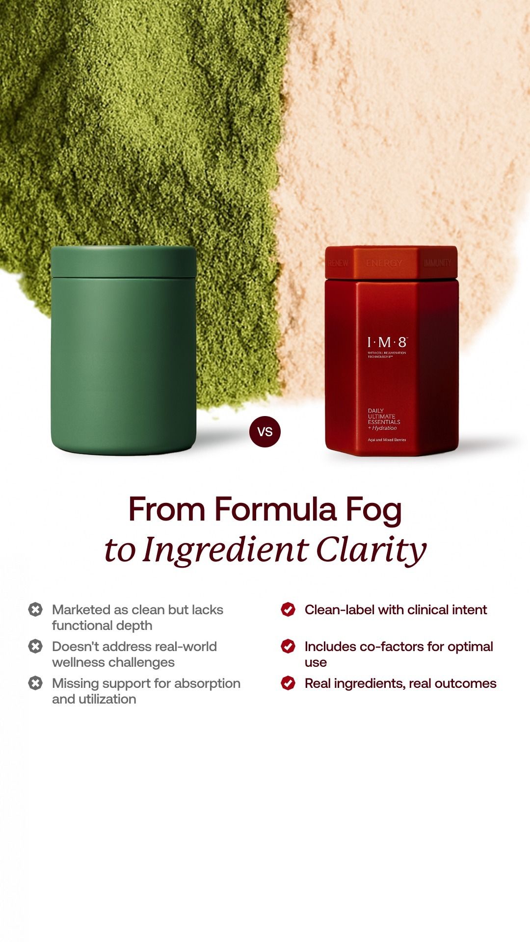
A clean, static comparison that quietly aims AG1 — without naming it.
Two jars. Two powders. One clear winner.
The headline says it all:
“From Formula Fog to Ingredient Clarity.”
Green vs. red. Confusion vs. confidence.
AG1 looks vague. IM8 looks precise.
Why It Works
Clear Enemy Framing. Uses contrast, not confrontation, to position against AG1.
Visual Simplicity. Clean split-screen instantly communicates “us vs. them.”
Smart Copywriting. “Formula Fog” vs “Ingredient Clarity” sounds premium and memorable.
Subtle Confidence. No aggression — just facts and design doing the persuasion.
What You Can Learn
You don’t need to name your competitor — let the comparison be visual and implied.
Use structure for storytelling — symmetry guides the eye and simplifies decision-making.
Own a concept — phrases like “Ingredient Clarity” can become a long-term brand asset.
Ad #6 – The “Switching Carousel”
I’ve seen very few brands do carousel ads right. IM8 absolutely nails it.
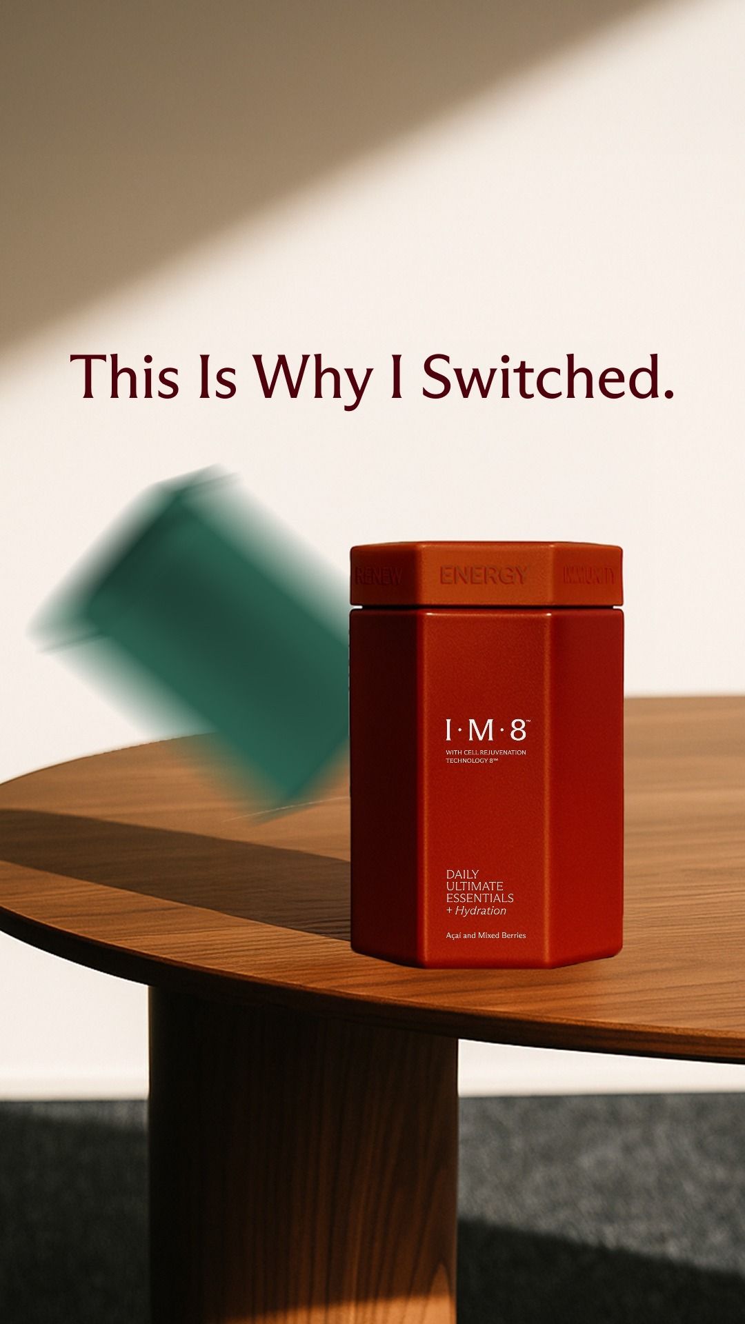
The first frame opens with a clean, confident line:
“This Is Why I Switched.”
It’s short, personal, and immediately sets up curiosity for what comes next.
Then, across three slides, IM8 delivers clear, factual comparisons — side-by-side with AG1’s green powder like:
✅ Clinical dosages (CoQ10, MSM, Vitamin K2, D3)
✅ Higher prebiotic fiber and Vitamin C
✅ Real quantities, not vague claims
You don’t need to read everything to get the message: IM8 is stronger, cleaner, and more transparent.
The final slide closes the loop perfectly:
“Ready to switch?” with a 30-Day Money-Back Guarantee button, removing the last bit of hesitation.
Why It Works
Narrative Flow. Each slide feels like a chapter in the same story — curiosity, proof, then action.
Visual Consistency. Same layout and tone across slides make the message sink in.
Transparency as a Weapon. Listing exact dosages instantly builds trust.
Perfect CTA. “Ready to switch?” feels natural after the proof buildup.
What You Can Learn
Use carousel ads like storytelling — not random slides.
Repeat visual patterns so the viewer can compare without thinking.
Earn the CTA — make the switch feel logical, not forced.
Key Takeaways from IM8’s Ad Strategy
IM8 positions itself through comparison. It doesn’t avoid AG1—it uses it as context to highlight what makes it better.
Every ad makes the switch feel logical, not emotional. The reasoning moves from better taste to clearer formulation.
The visuals carry meaning. Toggles, phone batteries, and underwater curls turn complex health ideas into something instantly understandable.
The brand stacks credibility through doctors, athletes, and real users. It feels trustworthy without needing heavy production.
The tone and design stay consistent across every format, whether it’s video, static, or carousel.
Each ad follows a story-like rhythm: build curiosity, show proof, and close with a natural call to action.
The overall message stays simple. No fluff, no jargon, just clean visuals and one clear message per ad.
Thanks to our partners who support this newsletter.
Tools worth checking out:
Atria: You're only as good an advertiser as your swipe file. Atria helps save good ads and analyze them in-depth. But the best part? Their AI helps me create concepts and scripts within seconds. Check it out for free. Most importantly, they now have built-in ad analytics to make more winning ads.
Happy Growing with Paid Social,
Aazar Shad
Since this newsletter is free, I do it to follow my curiosity. But I’d love it if you could leave some feedback so I know if I am helping you or not.
Four ways I can help you, whenever you are ready:
Work with me to get you growth from paid marketing. Book a call here. I’m open to more clients now.
Level up your paid marketing by joining my community, where we share the latest tactics and get nuanced paid marketing questions answered here (we are now 92+).
Promote yourself to 15,000+ highly qualified paid marketers by sponsoring this newsletter. Advertise here.
If you’re looking to level up your creative ad strategy, check out our bootcamp recordings and resources on-demand, only for $197. Prices are going up by 30% soon. Simply pay here, I’ll send you a follow-up email immediately.
And if this was forwarded to you, subscribe below with 1-click:


