What's up, Marketers! This is Aazar.
This newsletter is about leveling up your paid growth marketing skills by analyzing the best brands' paid strategy, tactics, positioning, and value props.
This newsletter is divided into:
Sharing what I've learned
Sometimes sharing some other performance marketers’ lessons with you
And I analyze & compare the best ads on the internet (this issue)pa
BEST LINKS OF THE WEEK (on popular demand)
My favorite finds
One thing I've learned as a marketer:
Your own buying habits will teach you more than any course.
Every time you buy something because of an ad, slow down and ask: "Why did this work on me?"
That's exactly what happened with Stepprs.
For years, my feet have been limiting me.
I have plantar fasciitis in my left foot, which means I can't run past 10 km without feeling it.
The pain pulls me back every time, no matter how motivated I am. It's frustrating. It stops me from doing simple things... like even trying for a marathon one day…
So when a Stepprs ad showed up on my feed with a line that felt written for my exact problem, I stopped scrolling.
Then they showed a clean, simple product demo. Nothing fancy. Just the kind of proof that makes your brain go, "Okay... this actually works."
I bought it because the ad reached into a very specific limitation in my life and made me imagine what it would feel like to move without it.
That's the part I want to break down.
Stepprs makes psychological ads. Ads that speak to real frustrations. Ads that make the solution feel instant, obvious, and believable.
So today, I'm breaking down five Stepprs ads that do this beautifully. Each one leans on a psychological concept you can steal, especially if you're selling a physical product.
Let's get into it.
Ad #1 – The "Egg Drop Stress Test" Ad
It convinced me without saying anything.
This ad grabs attention in the first 0.5 seconds. No voice. No text. Just raw visual:
Egg dropped on Insole #1 → breaks
Egg dropped on Insole #2 → breaks (And it has a Nike logo on it, subtle but important)
Egg dropped on Stepprs → doesn't break
Then they toss the same egg on the ground to prove it isn't fake.
Pure, fast, undeniable proof.

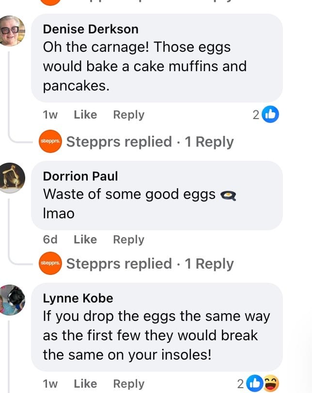
Engagement on the Egg Test ad
Plus, they have some great engagement on this ad. Strong proof that this ad is working for them.

Engagement on the Egg Test ad
Why this ad works:
Opens with a "WTF" moment (eggs + insoles is unexpected)
No talking, so the viewer processes the visual instantly
Shows extreme shock absorption in a way the brain can't argue with
The "same egg" demo kills the thought of trick editing
Makes the product feel strong enough for steel toe boots & 12-hour shifts
The power of powerful demonstration
The psychological bias:
Pattern Interrupt
Your brain stops when it sees something unusual. Egg + insole is not a normal pairing. Instant curiosity.
No “fluff” claims, no persuasion. The egg surviving is undeniable proof.
The "Real Object Verification" Cue
Throwing the same egg onto the floor proves authenticity. It removes suspicion and builds deep trust instantly.
What you can steal:
Start with a surprising visual, not text
Use an extreme demo to show the product's promise without talking
Add a quick authenticity cue to kill doubt
Mention benefits after the visual hook, not before
Ad #2 – The "Instant Relief Proof" Ad
(The ad that made me buy too. There were in total 2 ads that convinced me actually)
This ad goes straight for the pain point. Plantar fasciitis.
It shows a visual pressure map, then hits you with "Treat it in just one wear," "Orthopedic approved," "Instant relief," and "90-day guarantee."
Everything is simple and believable.
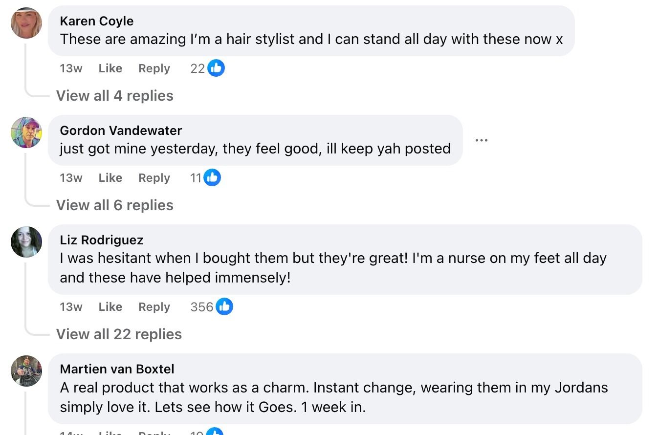
And look at the engagement on this one. Scroll through the comments and you'll see dozens of people posting their own relief stories. That kind of social proof is impossible to fake.

High engagement

Strong social proof in the comments
Why this ad works:
Hyper-specific callout makes you feel seen
Clean visual demo your brain accepts instantly
Promise of relief in the first wear
Strong trust signals (200K+ customers, orthopedic approved)
Risk removed with a long guarantee
The engagement is massive. Hundreds of comments from real customers confirming the product worked.
The psychological bias:
Instant Relief Bias
People overvalue solutions that promise fast physical comfort, even before trying them. When you're in pain, "now" beats "later."
That's exactly what pulled me in.
I wanted instant relief without the hassle of doctor visits, waiting rooms, or prescriptions. This ad gave me that promise in one line.
What you can steal:
Call out a very specific pain
Use a visual demo that immediately proves the fix
Add trust + authority in simple words
Make the first use experience the hero
Ad #3 – The "Bad vs Good" Proof Video
The video starts with a simple punch: "Work a 12-hour shift like this... or like this."
Two insoles. One flimsy. One thick, cushioned, supportive.
They show why Stepprs is better. The video demonstrates it. You don't need an explanation. Your brain already believes it.
The rest is fast:
Comfort
Arch support
Pressure points
Trim-to-fit
"Selling out quick"
Zero fluff.
Why this ad works:
Visual comparison communicates everything in one second
Demo makes the comfort look real and physical
"12-hour shift" speaks directly to people who stand all day
The trimming moment makes it feel universally compatible
Subtle urgency ("selling out quick") nudges action without yelling
The psychological bias:
The Comparison Effect
People judge products instantly when shown side-by-side. A weak option next to a strong one makes the strong one feel even stronger. It removes thinking. The decision becomes automatic.
What you can steal:
Start with a visual comparison, not text
Use a demo the viewer can almost "feel" through the screen
Anchor the use-case to a specific type of person (shift workers, people who stand all day)
Add soft urgency at the end, not the beginning
Thanks to our partners who support this newsletter.
Tools worth checking out:
Atria: You're only as good an advertiser as your swipe file. Atria helps save good ads and analyze them in-depth. But the best part? Their AI helps me create concepts and scripts within seconds. Check it out for free. Most importantly, they have built-in ad analytics to create more winning ads.
They now have everything I need: a swipe file and discovery ads, an AI creative strategist, analytics for collaboration and client reporting, asset management to maintain a single library for my video editing team, and competitor tracking to monitor their every move.
Ad #4 – The "Text Written on Skin" Scroll-Stopper
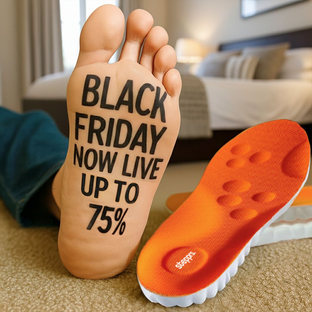
A giant foot fills the screen.
Actual words written on the sole of a foot: "BLACK FRIDAY NOW LIVE UP TO 75%."
This is Impossible to ignore, because it is weird and unexpected. Breaks the rhythm of the feed instantly.
Then you notice the Stepprs insole placed right next to it, with the same color palette.
Simple. Visual. Memorable.
Why this ad works:
Strong pattern interrupt (you don't expect writing on foot)
Your brain automatically tries to read text
The visual communicates the offer faster than a headline would
The foot itself becomes the ad space, making it playful and sticky
Ties the offer directly to the pain point location
The psychological bias:
Embodied Attention Effect
Humans are wired to notice bodies first. When text appears on a body part, your brain treats it as important or symbolic.
This forces people to stop and read, even if they don't care about the sale yet.
What you can steal:
Put your message on the object/body part associated with the pain
Use visuals people don't see every day (but keep them clean)
Let the image carry the offer instead of long headlines
Make the scroll-stopper the first frame, not the middle
Ad #5 – The "Simple" Creative
One clean visual. A smiling person holding two insoles.
Big, bold copy: "Our return policy is simple. Plantar fasciitis will never return."
That's it. No clutter. No complex layout. Just a confident promise and a Black Friday stamp pushing urgency.
Why this ad works:
The headline is direct and memorable
Extremely simple, so nothing distracts the viewer
Built around a single idea instead of multiple benefits
The 75% off Black Friday badge pulls the eye immediately
Visual of someone holding the product makes it feel real and friendly
The psychological bias:
The Bold Claim Effect
Strong, confident statements override hesitation, especially for pain-driven products. People dealing with physical discomfort want certainty. This ad gives them that feeling instantly.
What you can steal:
Use one strong promise instead of listing five benefits
Keep the layout clean so the core message hits harder
Pair a bold line with a visible product in someone's hands
Use a sale badge to anchor attention and frame urgency
Key Takeaways:
Faceless videos can still feel “human” when you show hands, reactions, and real product interaction
Simple demos beat complicated explanations
Specific pain points (like plantar fasciitis) pull in the right audience fast
Visual comparisons make the choice feel obvious
Pattern interrupts (egg test, text on skin) stop the scroll instantly
If your product can be demonstrated physically, you don’t need faces. You need clarity and close-ups.
Soft urgency ("selling out quick", Black Friday stamps) nudges action
Trust signals (orthopedic approved, 90-day guarantee, 200K+ customers) lower risk
One psychological trigger per ad makes the message stick
Clean layouts + bold claims get processed quicker than noisy creatives
Extreme demos build more belief than long benefit lists
Comment sections with real customer stories remove doubt faster than any copy
Another partner shoutout.
I've been using a tool to launch ads in bulk every week with just 3-5 clicks or fewer. I used to spend at least 15-20 hours/week on this, but now it takes only 2 hours/week.
I'm grateful for this tool because it has helped me scale my agency and focus more on creative work rather than just media buying aka uploading ads.
This tool is called Admanage. It’s a bit pricey, but on an hourly savings basis, it only costs 2 hours of my entire month’s time. Plus, you can't just self-onboard; you need some help initially. So, talk to their team.
My average is around 500+ ads a month already and 1000+ due to BFCM.
You’ll thank me in 30 days once you’ve automated ad upload management, at least. There are more features that I love, but this is the best one.
Happy Growing with Paid Social,
Aazar Shad
Since this newsletter is free, I do it to follow my curiosity. But I’d love it if you could leave some feedback so I know if I am helping you or not.
Four ways I can help you, whenever you are ready:
Work with me to get you growth from paid marketing. Book a call here. I’m open to more clients now.
Level up your paid marketing by joining my community, where we share the latest tactics and get nuanced paid marketing questions answered here (we are now 90+, but there is a waitlist to join).
If you’re looking to level up your creative ad strategy, check out our bootcamp recordings and resources on-demand, only for $197. Prices are going up by 30% soon. Simply pay here, I’ll send you a follow-up email immediately.
Promote yourself to 15,000+ highly qualified paid marketers by sponsoring this newsletter. Advertise here.


