Most brands overthink ad strategy. These DTC giants don’t. They just test fast, learn faster—and simplify the hard stuff.
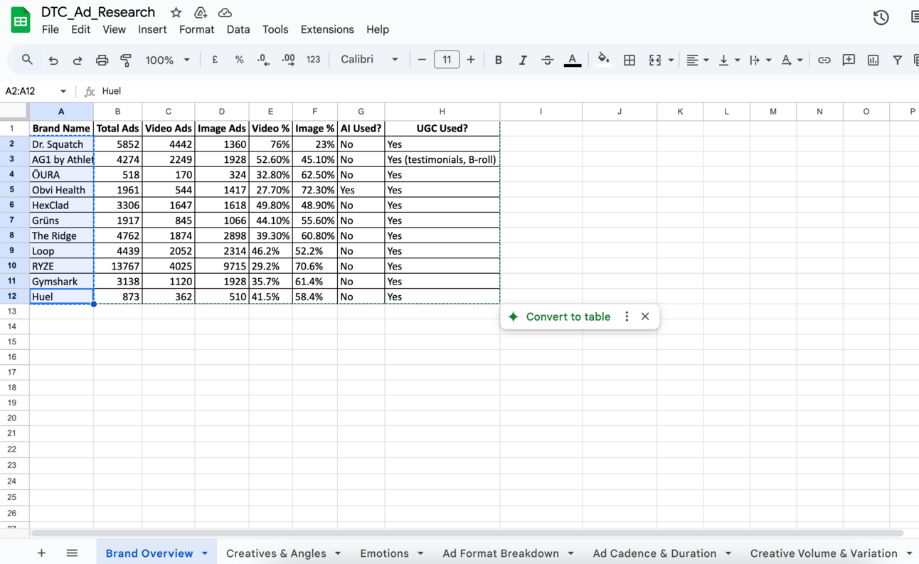
I looked at the paid ads from 11 nine and ten-figure DTC brands, analyzed over 40,000 creatives—across different angles, emotional appeals, and persona types —to uncover what actually works. We spent 40+ hours making into this report to know what’s working for DTC brands.
Together these 9-figure brands have $2.8 Bn in revenue.
Plus, I have to thank Noman and Atria AI (for tracking all the data, angles, hooks and positioning) for all the help creating this analysis.
Anyway, we studied:
What ad formats they use
Which emotions they lean into
How often they rotate creatives
Whether they use UGC or polished assets
And what type of landing pages they drive traffic to
Let’s dive in.
Note: This post might get clipped due to the length so here’s the web link.
Table of Contents
Brand #1: Dr. Squatch
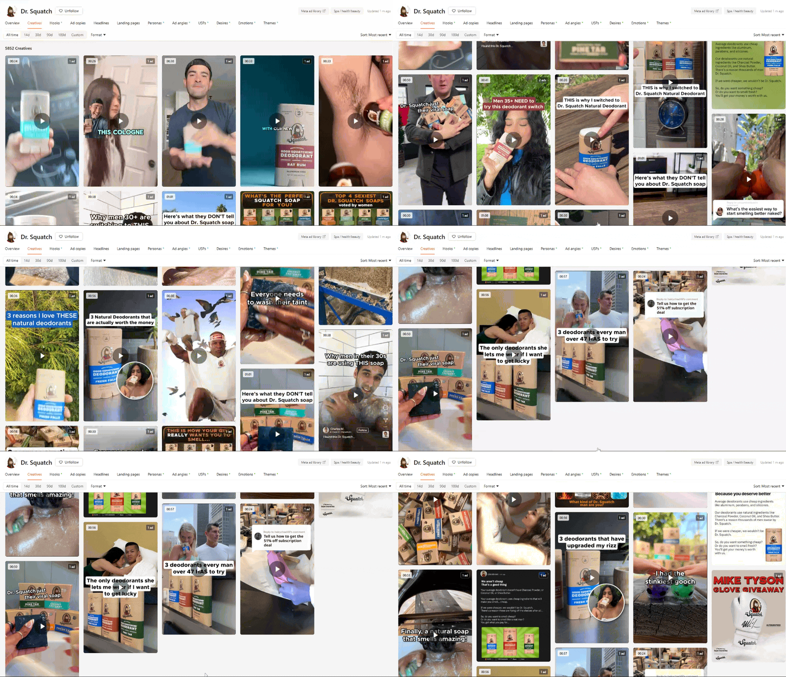
Dr. Squatch is the volume king. With over 5,800 creatives, they’re always testing something new.
One ad features Mike Tyson in a bold testimonial. Another looks like a fun video you’d never scroll past.
A lot of their ads don’t look like ads. They trust the hook, not just the production. It’s fun. It’s punchy. And it works.
Creatives: 5,852 (76% video, 23% image)
Style: Polished + UGC mix (Think: Tyson vs. TikTok bros)
Hooks: Skits, humor, high contrast visuals like "Guys, here’s what girls want you to know"
Emotions: Amusement, Excitement, Joy
Strategy: Constant refresh. New hooks, angles, and personas weekly.
Pages: Collection and product pages. Focused on grooming and male hygiene.
Standout: Huge variety and humor-forward. Most creative volume in the batch.
Why it works:
Massive creative diversity keeps fatigue low for audience
Humor-driven hooks grab quick attention
Mixes polished and native content by platform
Speaks to self-care skeptics and gift-buying partners
Brand #2: AG1 by Athletic Greens
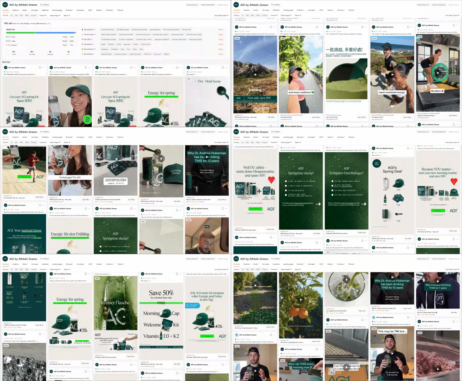
AG1 feels like health advice from someone you trust.
Their ads are calm, polished, and grounded. You’ll often hear a soft voiceover breaking things down while clean visuals flow on screen.
They’re not pushing hard. They’re just showing up with clarity, routine, and science-backed claims.
Creatives: 4,274 (52.6% video, 45.1% image)
Style: Mostly polished. B-roll testimonials. Polished VO ads.
Hooks: Transformation, routine-building, "Energy you can feel"
Emotions: Confidence, Trust, Hope
Strategy: High variation. Launches often. Ad tweaks + LP testing.
Pages: Subscription LPs, bonus-pack offers
Standout: Science-backed meets emotional storytelling. Massive creative output.
Why it works:
Storytelling builds credibility
Scientific claims increase authority
Core messages (routine, immunity, energy) repeated often
Minimal UGC, but strong use of customer proof
Brand #3: ŌURA
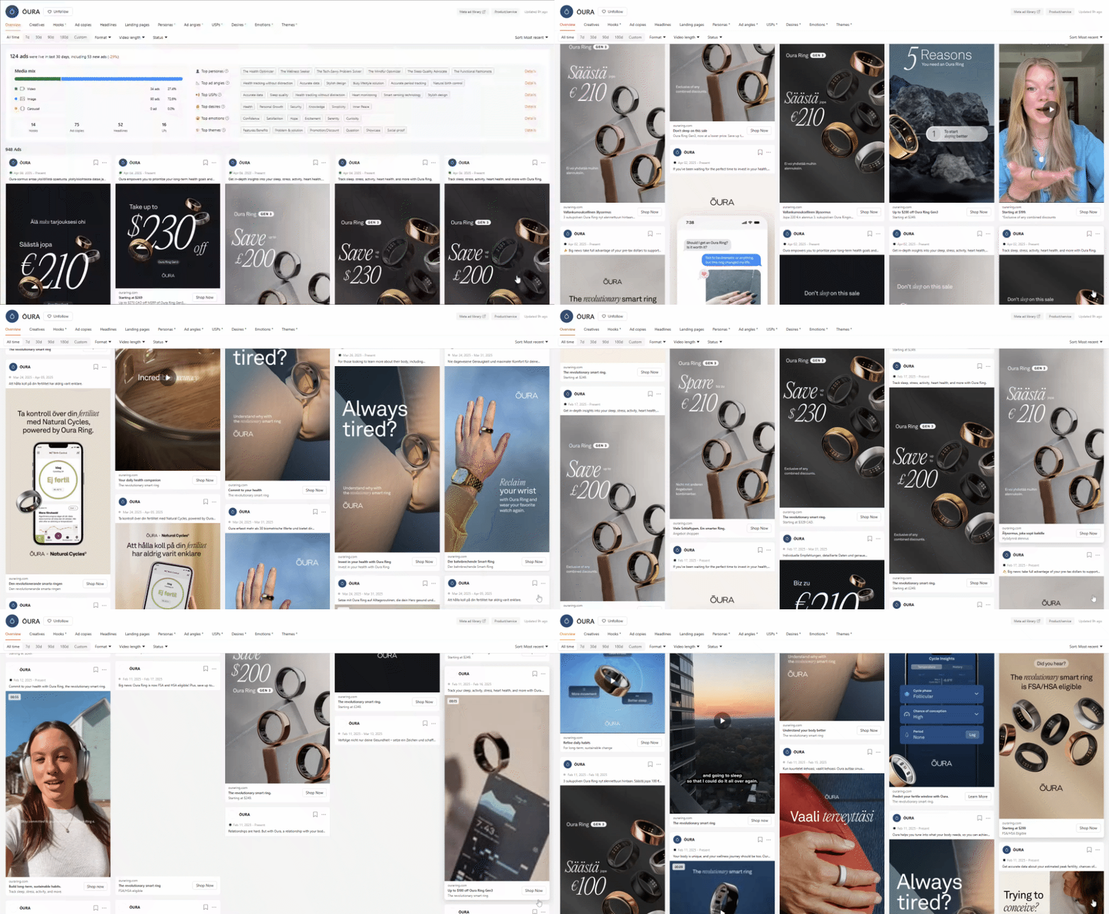
ŌURA makes health feel sleek. Their ads look like something out of a wellness magazine. Soft lighting. Calm energy. Clean copy.
And it’s never really about the ring—it’s about what the ring helps you do. Sleep better. Train smarter. Understand your body.
Creatives: 518 (32.8% video, 62.5% image)
Style: Polished imagery, minimal text, wearable demo shots
Hooks: "Know when to train and when to recover", "Track your cycle"
Emotions: Confidence, Serenity, Curiosity
Strategy: Persona-focused. Rotates creatives across personas, tweaks hooks.
Pages: Wellness-focused product pages
Standout: Calm, tech-forward, non-pushy visuals. Focus on insight-led content.
Why it works:
Emotions like control and calm are front and center
Outcome-focused: sleep, cycle, recovery
Strong FemTech and optimization angles
Simple visuals, low distraction, high insight
Thanks to our partners who support this newsletter.
Tools worth checking out:
Atria: You're only as good an advertiser as your swipe file. Atria saves and analyzes ads, and its AI creates concepts and scripts in seconds. Try it for free. It now includes ad analytics and an AI creative strategist for better ads. Watch this video to see how I use their AI recommendations.
Creatopy: Top brands use Creatopy to quickly create and resize ads for platforms like, Google Instagram and Facebook, ensuring brand consistency. It automates translations and updates headlines across all variations. Previously time-consuming tasks now take seconds, allowing for 50+ ad variations effortlessly. Try Creatopy free to transform your ad production workflow.
Creative OS: Don’t waste your designer’s time in copying swipe files. Get all static ad templates to increase your experiments and ad creatives’ velocity. Check it out here.
Brand #4: Obvi Health
Obvi knows their customer. Their ads are vibrant, bold, and full of energy. Weight loss, beauty boosts, and feel-good confidence are the core messages.
They lean into the “before/after” story—but keep it fun, flashy, and feminine.
BTW, This is the only brand I found clearly using AI images (Can’t say about others because AI is just getting too good by each day, lol😅)
Creatives: 1,961 (27.7% video, 72.3% image)
Style: Polished with some UGC. Strong use of text overlays and seasonal offers.
Hooks: “This is like giving your body a turbo boost”, “See the difference in 90 days”
Emotions: Hope, Joy, Motivation
Strategy: High cadence. Rotation of hooks. Fat loss and beauty themes.
Pages: Promo-heavy LPs and discount bundles
Standout: Skews female. Strong emotional pitch mixed with urgency.
Why it works:
Messaging built for women with clear transformations
Scroll-stopping visuals (text overlays, color pops)
Combines UGC with polished offers
Hooks like “Feel good in 90 days” hit fast
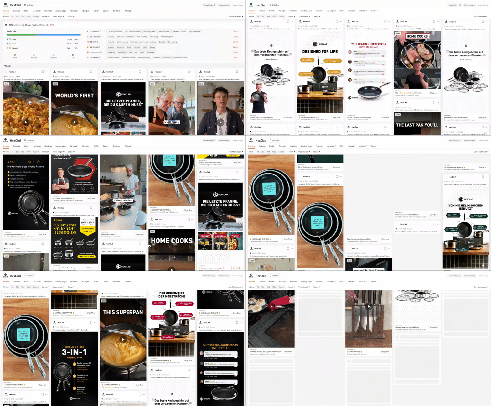
Brand #5: HexClad
HexClad makes pans feel like a luxury purchase. Some of their best ads feature Gordon Ramsay educating about why he prefers HexClad. Others ads are mix of UGC and product shots with benefits.
They don’t explain much (except for the benefits). They just show you—and let the product do the talking.
Creatives: 3,306 (49.8% video, 48.9% image)
Style: Polished B-roll, chef demos, some UGC
Hooks: “Why I stopped replacing cookware every year”
Emotions: Satisfaction, Trust, Joy
Strategy: Lean into quality and utility. Seasonal offers, price/quality comparisons
Pages: Product and comparison-focused
Standout: Culinary luxury angle. Strong product storytelling.
Why it works:
Gordon Ramsay = built-in trust
B-roll videos highlight product benefits with voiceover
Comparison-focused messaging ("Lasts longer")
Sensory visuals = instant appeal
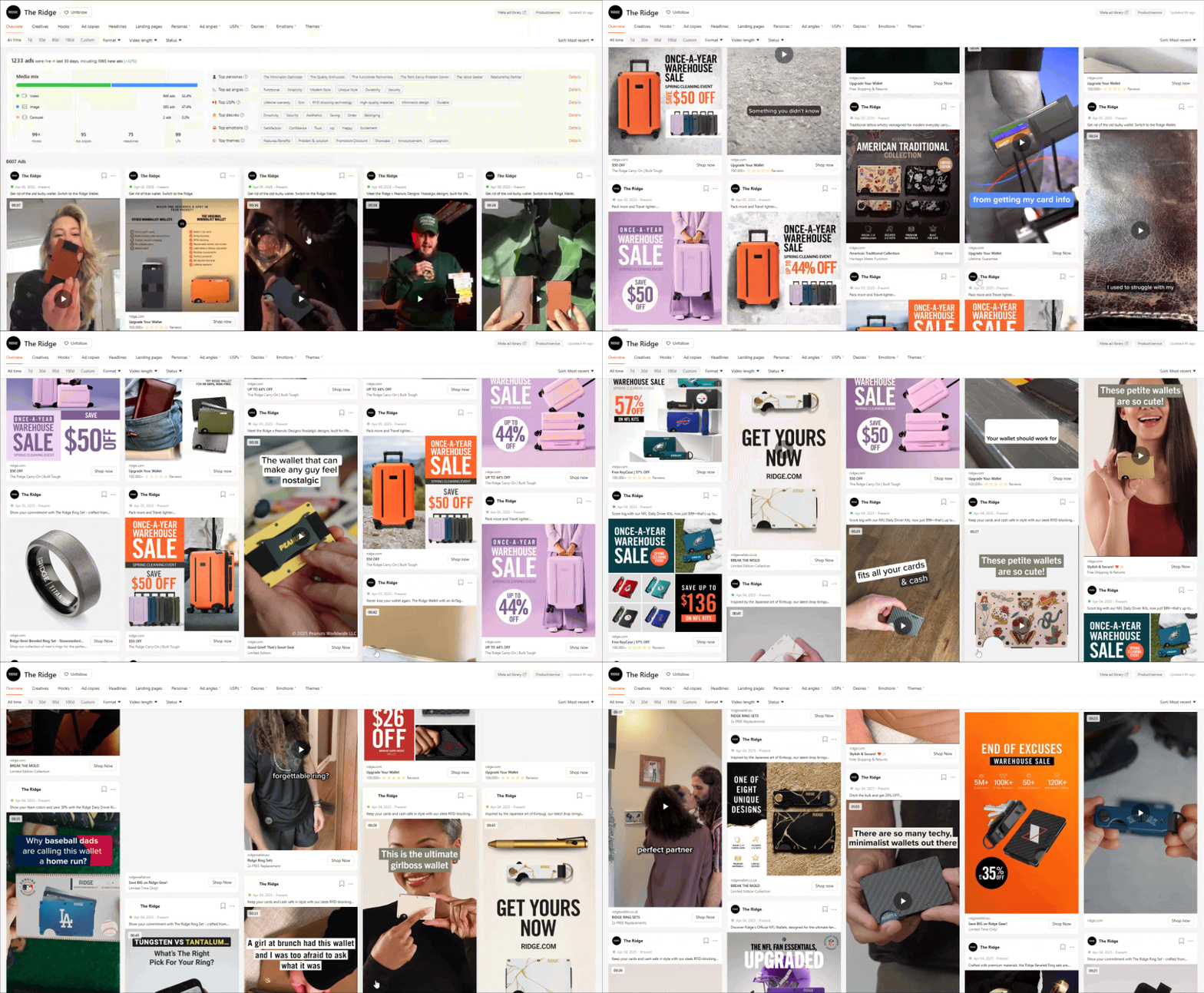
Brand #6: The Ridge
The Ridge makes minimalism masculine. Their best ads are simple comparisons—bulky wallet vs. Ridge.
They keep it clean. Straight to the point. And often let the visuals carry the message.
Creatives: 4,762 (60.8% image, 39.3% video)
Style: Polished video testimonials, comparison, UGC
Hooks: "This replaced my wallet", "Look how sleek this is"
Emotions: Satisfaction, Trust, Confidence
Strategy: Comparison ads. Long-term rotations. Minimalist visual identity.
Pages: Product pages
Standout: Simplicity sells. Premium without shouting.
Why it works:
Comparison visuals make the case in 2 seconds
UGC + polish mix gives variety
Messaging is clear, confident, and benefit-first
Social proof is a constant theme
Brand #7: Loop Earplugs
Loop doesn’t just sell earplugs, they sell relief. One standout tactic: they create targeted ads for each specific audience segment.
From ADHD users to concertgoers, they’ve nailed the positioning: noise is the villain.
Their messaging speaks to overstimulation, distractions, and noise-induced stress.
Creatives: 4,439 (52.1% image, 46.2% video)
Style: UGC heavy. Polished demos. Noise is the enemy.
Hooks: “Peace and quiet, finally”, “Block out what you don’t want”
Emotions: Relief, Serenity, Focus
Strategy: Focus on comparison + problem-solution. Many personas (sensory-sensitive, WFH pros)
Pages: Clear product use-case LPs
Standout: Noise = enemy. Messaging that deeply resonates.
Why it works:
Starts with a relatable pain: “too much noise”
Real testimonials feel raw and honest
Balanced mix of UGC and high-quality shots
Visual cues signal peace, calm, and focus
Brand #8: Gymshark
Gymshark’s big idea is to sell identity, not gym clothes.
The visuals are crisp. The vibe is focused.
And the message is you vs. you. Be better. Show up. Join the tribe. Every ad makes the viewer feel like they’re part of something.
Creatives: 3,138 (61.4% image, 34% video)
Style: Mix of UGC, polished product demos, testimonials
Hooks: “It’s you vs you”, “Gymshark and Whitney did it again”
Emotions: Confidence, Admiration, Satisfaction
Strategy: Broad range of personas. Active lifestyle seekers to fashion-forward gymgoers.
Pages: Category and collection pages (Adapt, Power, Whitney drops)
Standout: Fashion x fitness. They’re not selling gymwear. They’re selling identity.
Why it works:
Visuals are aesthetic and consistent
UGC + athlete content creates community feel
Product drops create urgency and exclusivity
Motivation-driven messaging builds loyalty
Brand #9: Grüns
Grüns is playful, smart, and not afraid to get weird.
Their top ads feature poop jokes, kid reactions, and split-screen “us vs. them” comparisons.
They position AG1, pills, and powders as villains—and make themselves the fun, tasty, obvious choice.
Creatives: 1,917 (split image/video, no AI)
Style: UGC, casual reaction-style + bold visuals
Hooks: “Best poop of my life”, “Your kid will love this”
Emotions: Humor, Relief, Surprise
Strategy: Clear enemy (powders, veggies, AG1). Reaction + transformation storytelling
Pages: Gummy-focused product LPs
Standout: Positioning masterclass. Turning greens into candy with edge.
Why it works:
Clear enemy positioning (powders, AG1)
Unexpected hooks = pattern disruption
Humor + testimonial = authentic credibility
Visual contrasts make decisions easy
Brand #10: Huel
Huel is all about efficiency. Their creatives say things like “Why spend $10 on lunch?” or “Meal prep in 30 seconds.”
Their ads are straightforward, UGC-led, and focused on real-life problems like cost, time, and energy.
Creatives: 873 (63.1% image, 36.9% video)
Style: UGC, testimonials, clear benefit-stacking
Hooks: “Why are you spending $10 on lunch?”, “Meal prep in under 1 minute”
Emotions: Satisfaction, Relief, Confidence
Strategy: Pain-point focused hooks. Strong repetition. Simplicity sells.
Pages: Product-first LPs (Black Edition, Savory Meals, Bundles)
Standout: Clear CTAs, no overproduction. Real problems, real convenience.
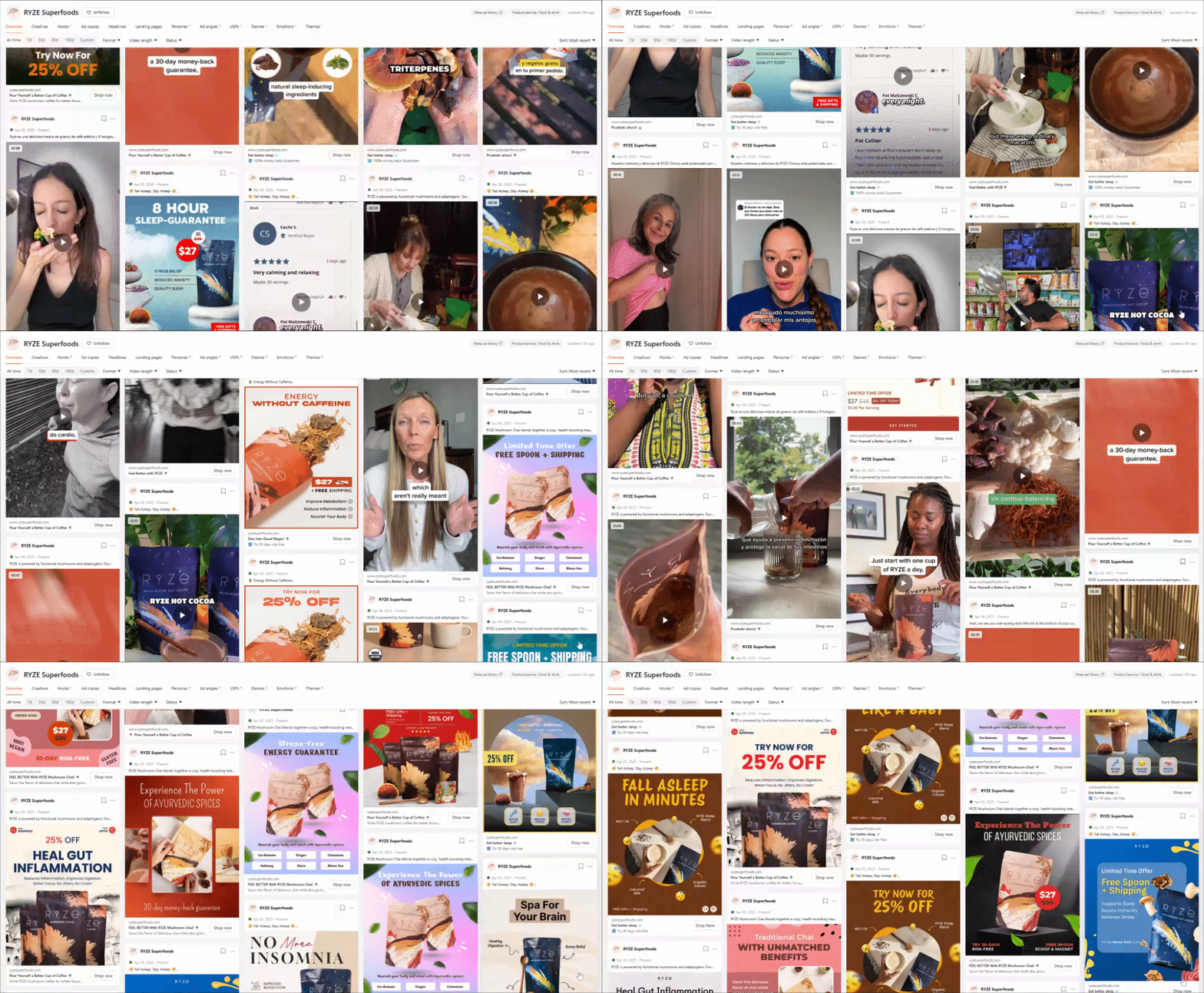
Brand #11: RYZE
RYZE makes mushroom coffee feel magical—but not in a woo-woo way.
Their hooks spark curiosity: “If your tongue is white…” or “Why I swapped coffee.”
They sometimes include lo-fi UGC with calm testimonials. It feels honest. Natural. Trustable.
Creatives: 13,767 (70.6% image, 29.2% video)
Style: UGC-heavy, native-style edits, simple statics with bold benefits
Hooks: “If your tongue is white…”, “Swapped my coffee for this”, “Good poops daily”
Emotions: Curiosity, Relief, Satisfaction
Strategy: Frequent hook refreshes, real testimonials, strong comparison to coffee
Pages: Product LPs, quiz funnels, trial offer pages
Standout: Feels real. Clean visuals, curious hooks, no hype—just habit-based health.
Why it works:
Curiosity hooks drive initial attention
Routine-based messaging builds habit value
Gut health and mental clarity as consistent angles
UGC and VO-led storytelling keeps it real
Key Takeaways From Studying 11 Brands (And 40,000+ Ads)
Here’s what kept showing up across the board:
1. UGC is STILL working
Even the cleanest brands still rely on UGC. It builds trust fast. Specially, Stealth UGC.
2. Ugly ads STILL work
Ads that don’t look like ads are used still used by these brands. Yes, they might have few branded ads but its the ugly ads that stop the scroll.
3. Emotion beats logic
The best ads made you feel something—
Confidence
Curiosity
Relief
Satisfaction
4. High volume = better insights
More creatives → faster learning → better ROAS.
Dr. Squatch and RYZE are textbook examples.
5. Comparison ads still crush.
Side-by-side visuals make decisions effortless.
Loop, Ridge, and Grüns all nail this.
6. Villains make heroes.
Great ads name the enemy.
Examples: Noise, Mess, Powders, Clutter, Pills, anything that’s enemy.
Make the enemy obvious, and your product becomes the answer.
7. Strong headline. Clear subtext.
The best ads hook fast, then explain simply.
8. Simplicity > polish.
A lot of these ads are unbranded, Native, and Minimal.
That’s what performs, especially in scroll-heavy feeds.
9. Landing pages match the ads.
There’s tight alignment from hook → click → conversion.
No bait-and-switch. No dead ends.
Three ways I can help you, whenever you are ready:
Work with me to get you growth from paid marketing. Book a call here. I’m open to more clients now.
Level up your paid marketing by joining my community, where we share the latest tactics and get nuanced paid marketing questions answered here (we are now 70+, but there is a waitlist to join).
Promote yourself to 14,000+ highly qualified paid marketers by sponsoring this newsletter. Advertise here.

